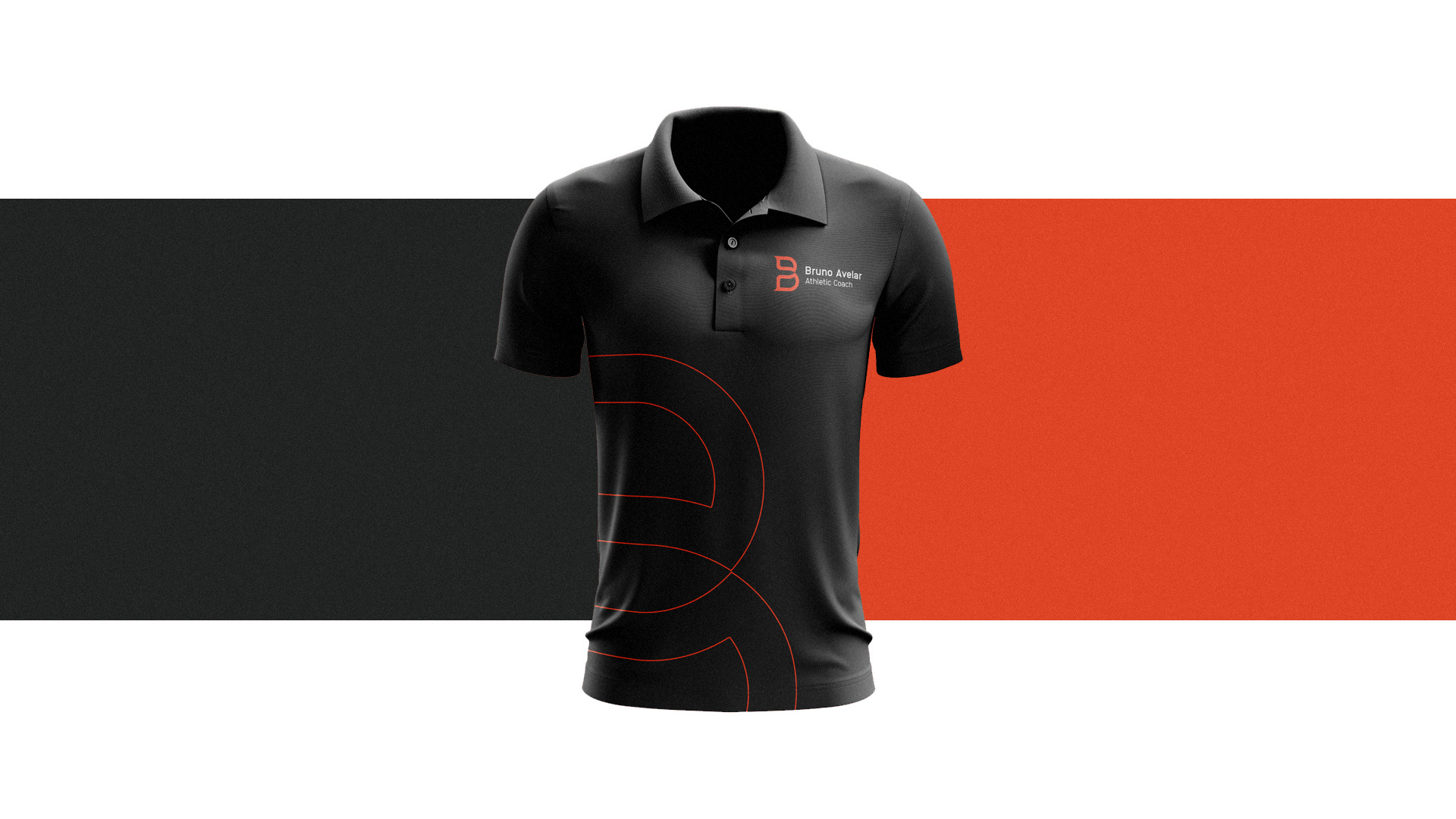
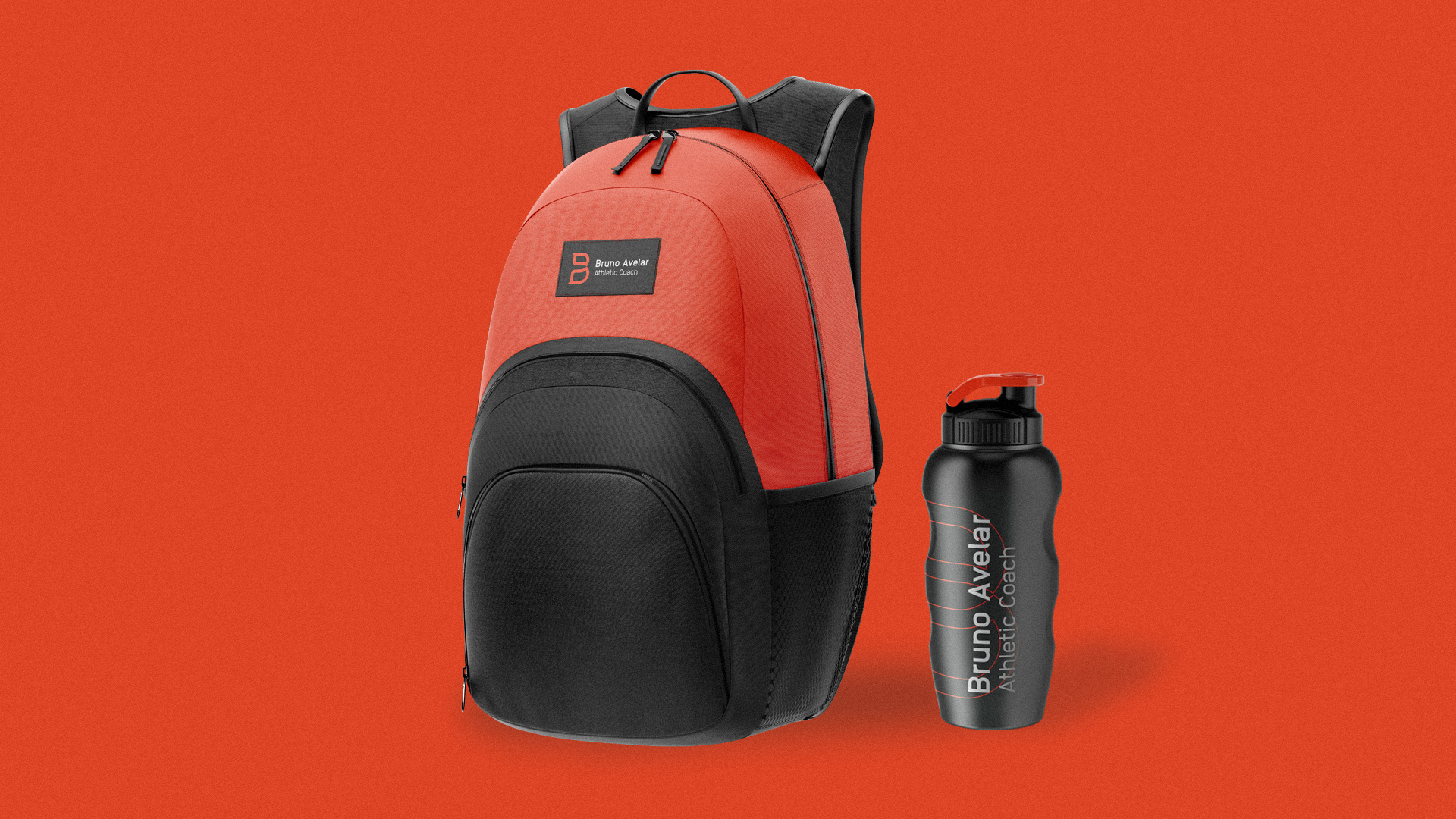
Bruno Avelar - Athletic Coach
EN
_
_
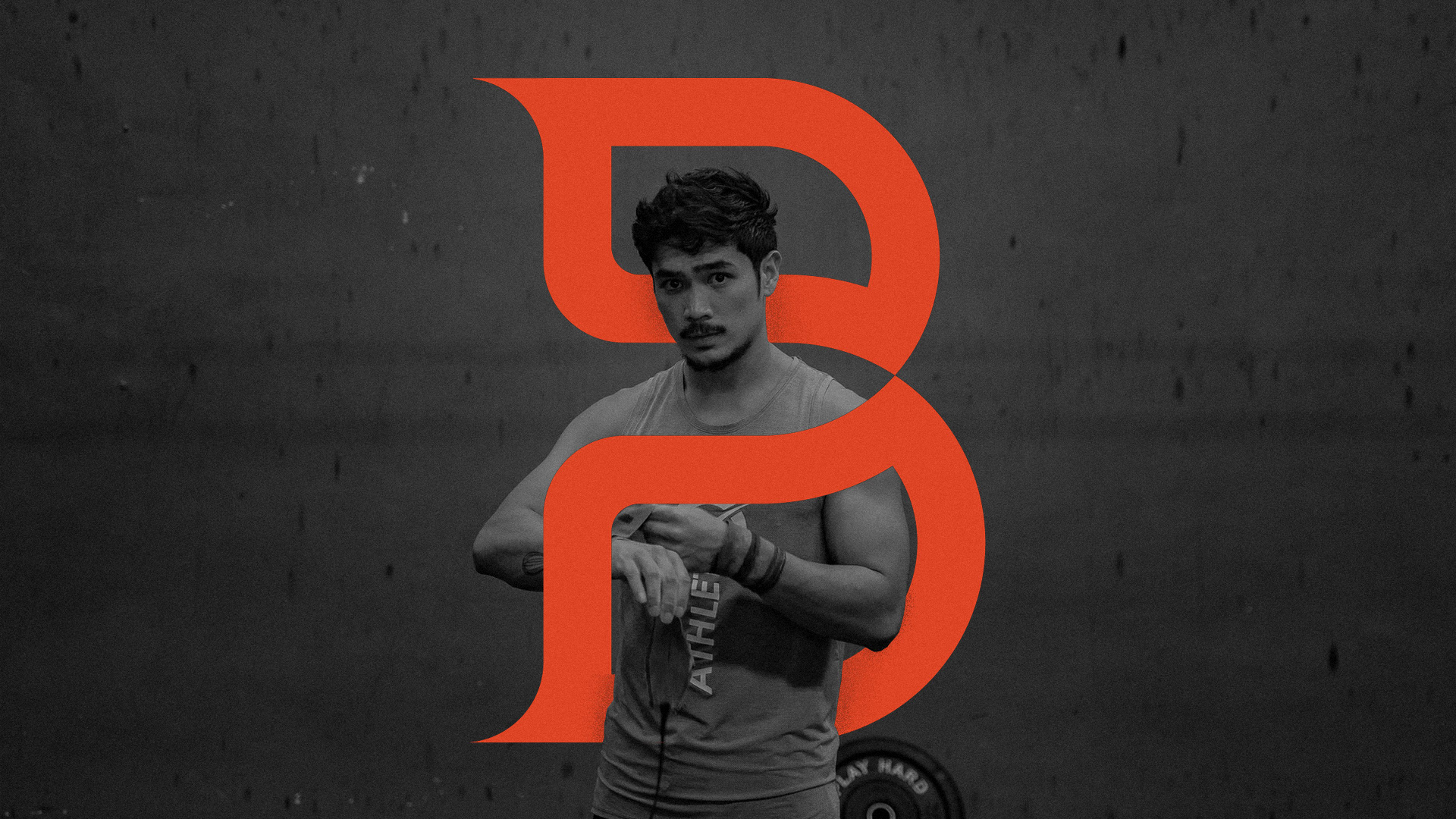
Bruno Avelar is a physical educator focused on practicing activities that include artistic gymnastics, Olympic weightlifting and bodyweight exercises. He contacted Ciano to create a visual identity with a unique aesthetic and completely different from its competitors.
To achieve this goal, an immersion was made in the market of Juiz de Fora and region, as well as in the client's own history, seeking to understand which differentials should be present in the visual identity, and also to understand which would be the essential concepts of the brand.
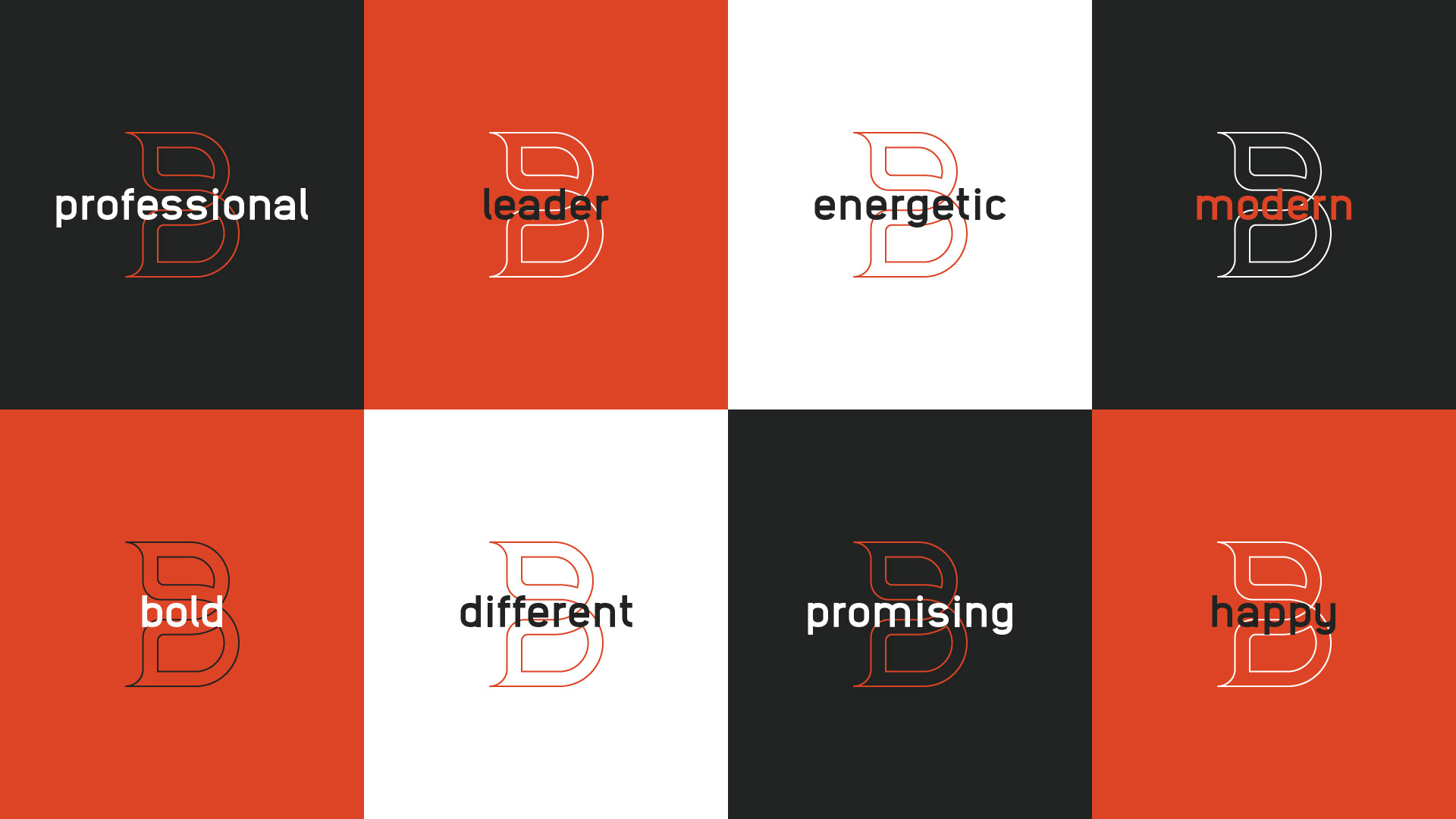
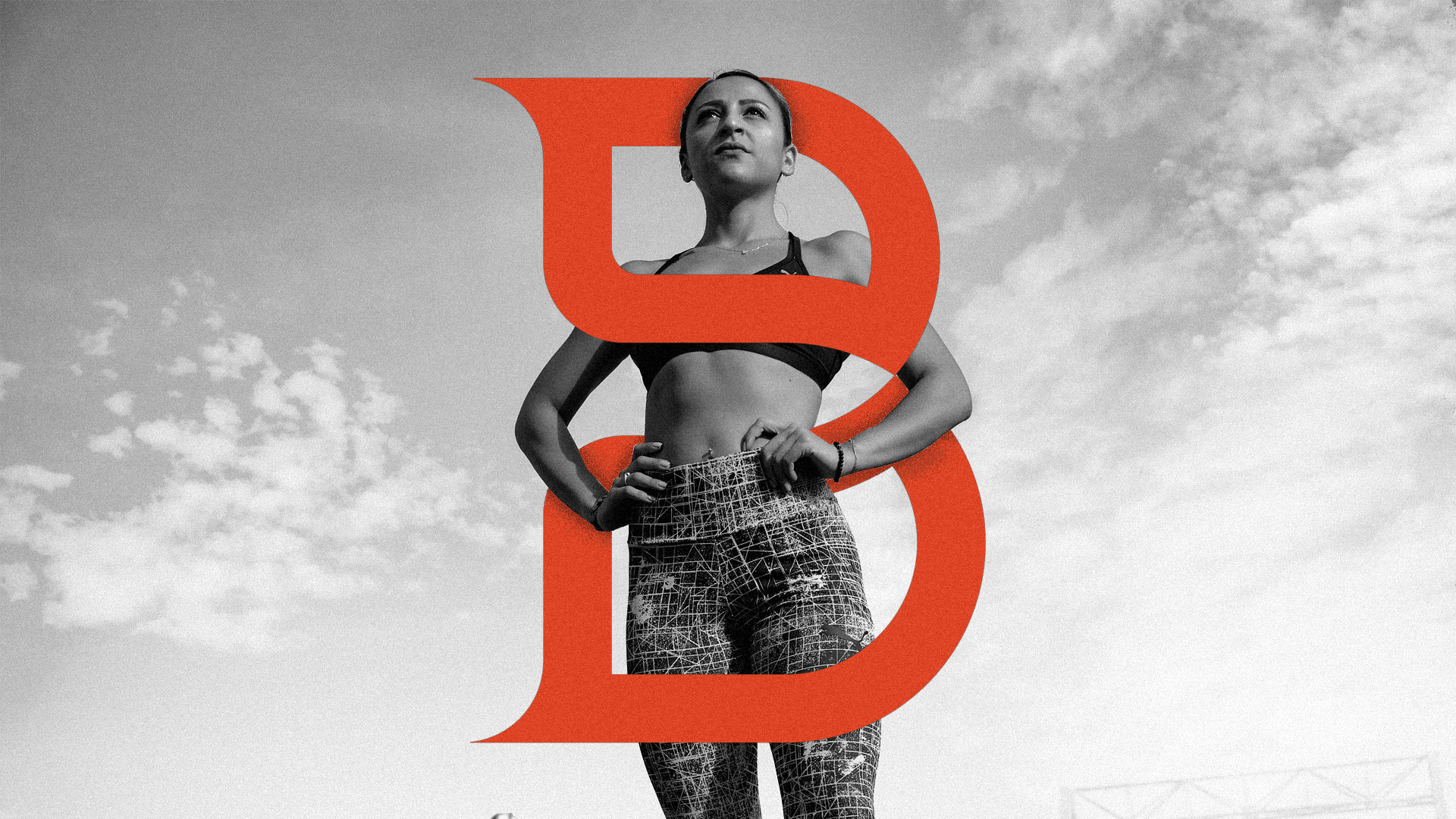
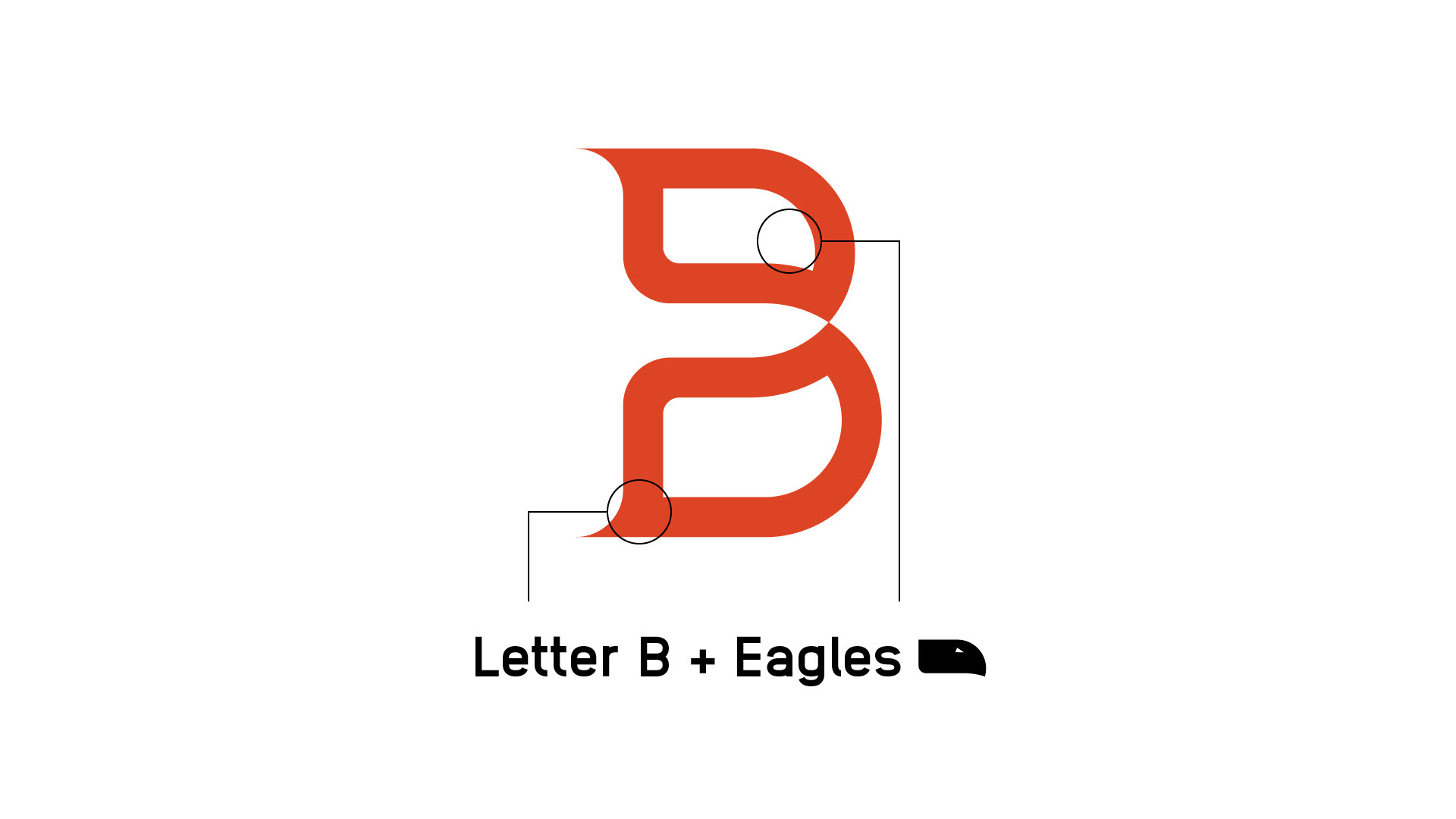
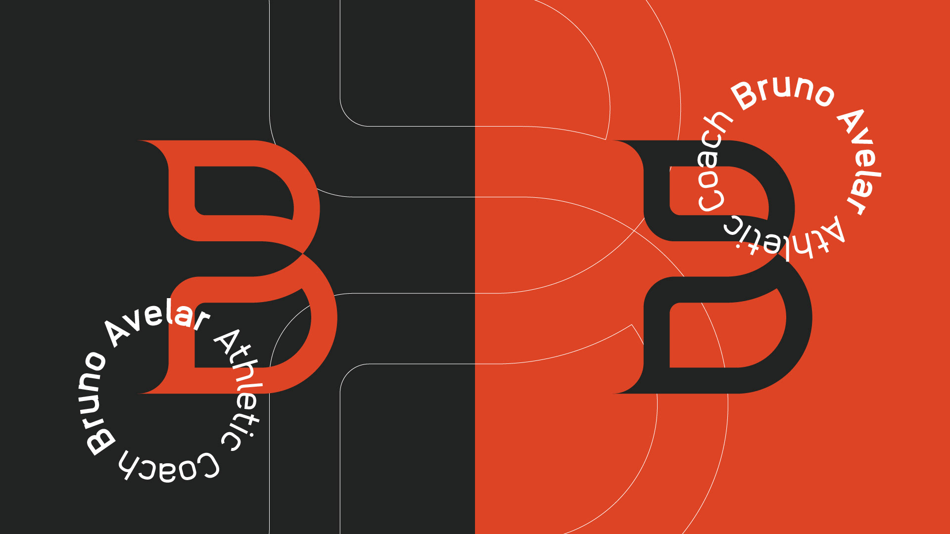
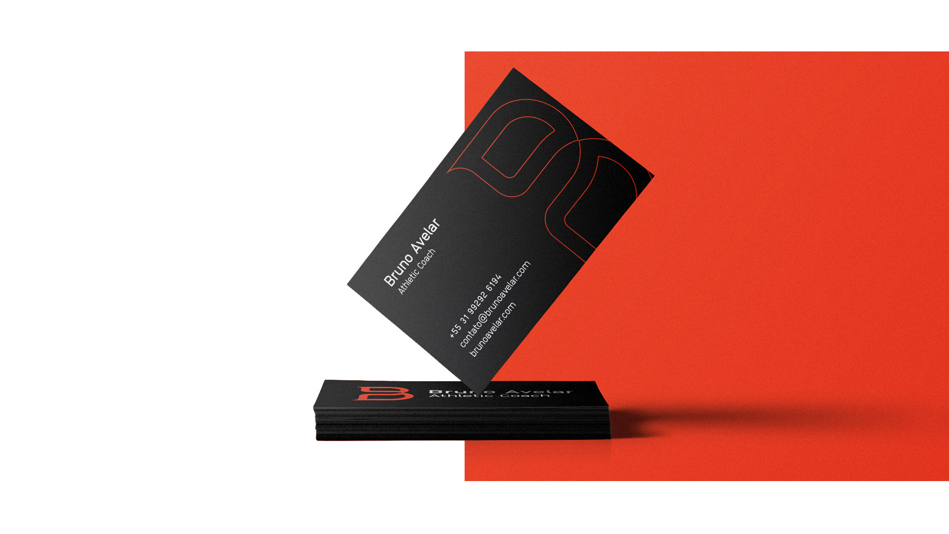
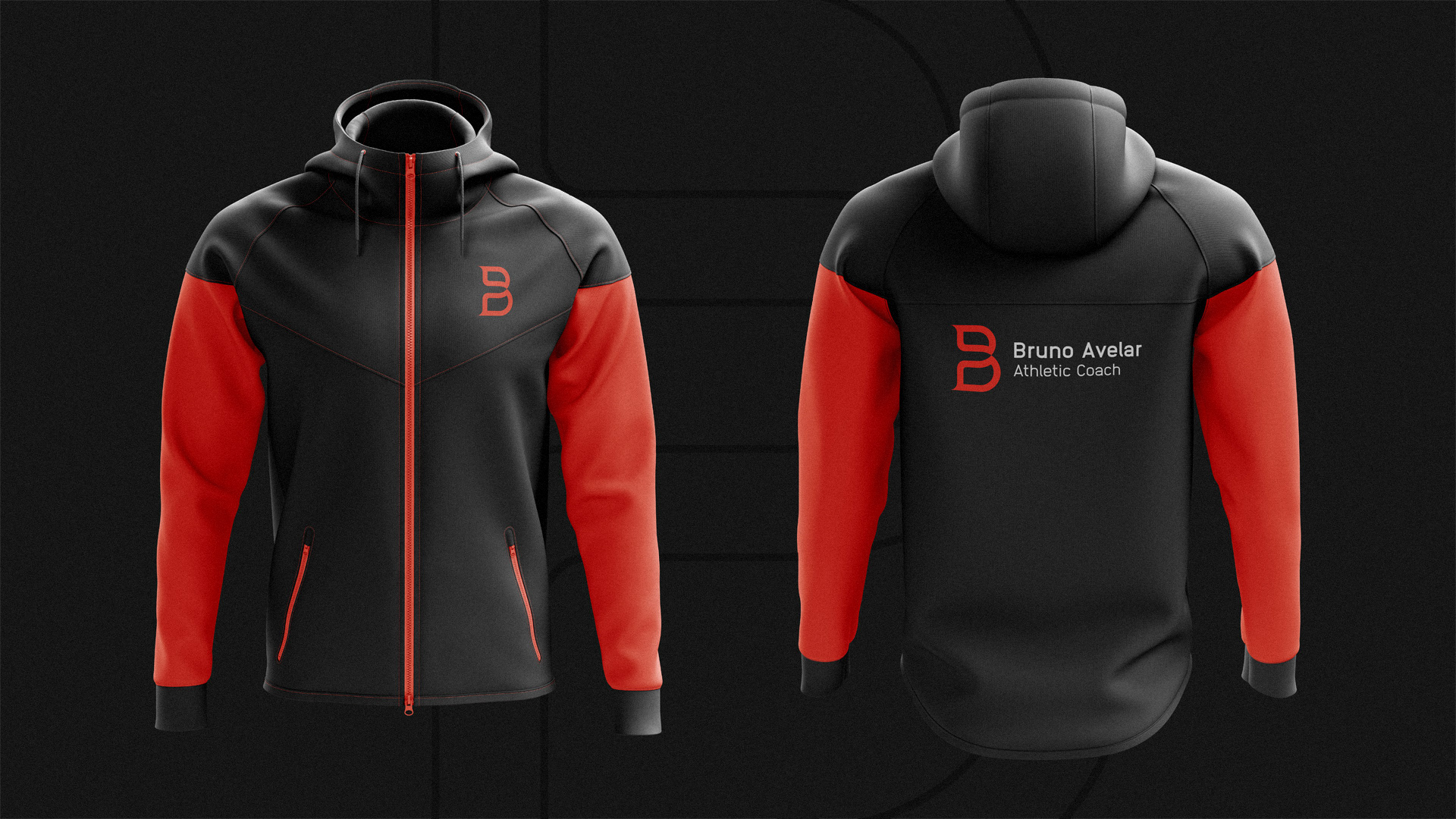
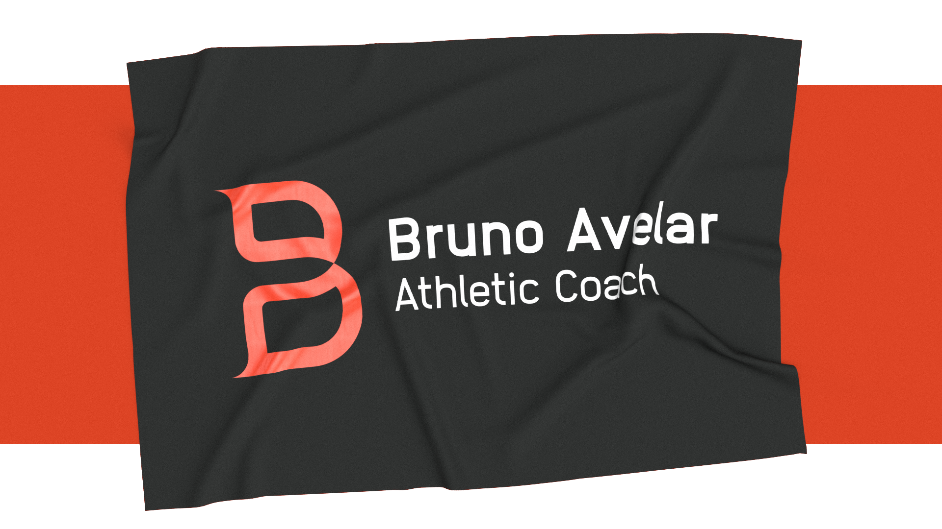
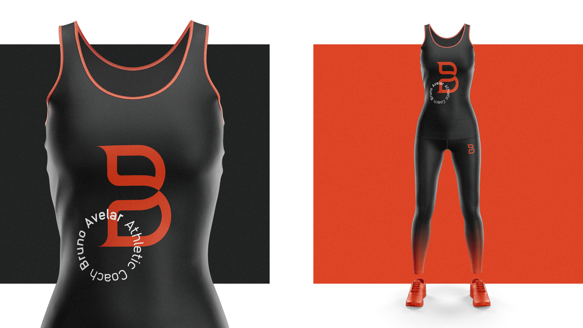
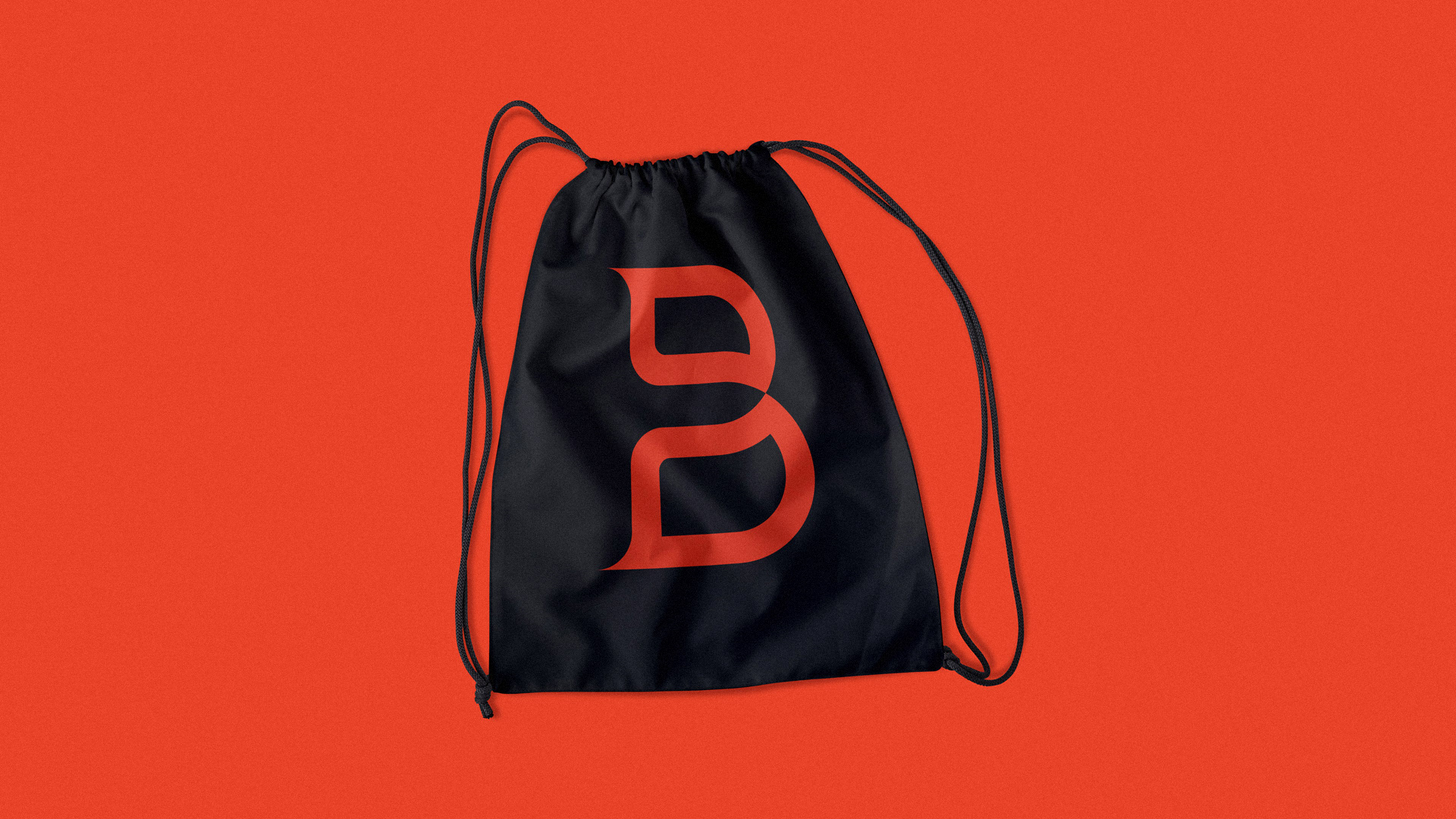
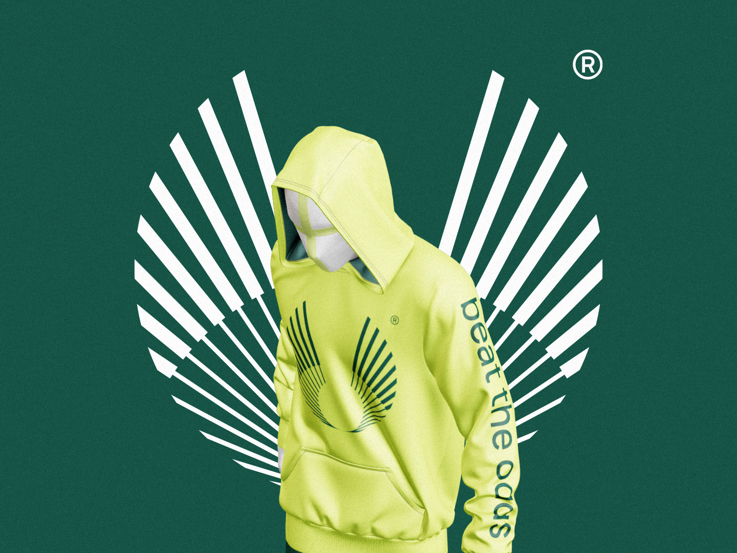
The symbol is based on two icons related to the customer story. The letter B, initial of the brand name, gives shape to the logo, as well as the eagles, present in a more discreet way. Eagles were chosen because they are the animal symbol of the United States, a country in which Bruno was part of his training and was instrumental in his professionalization.
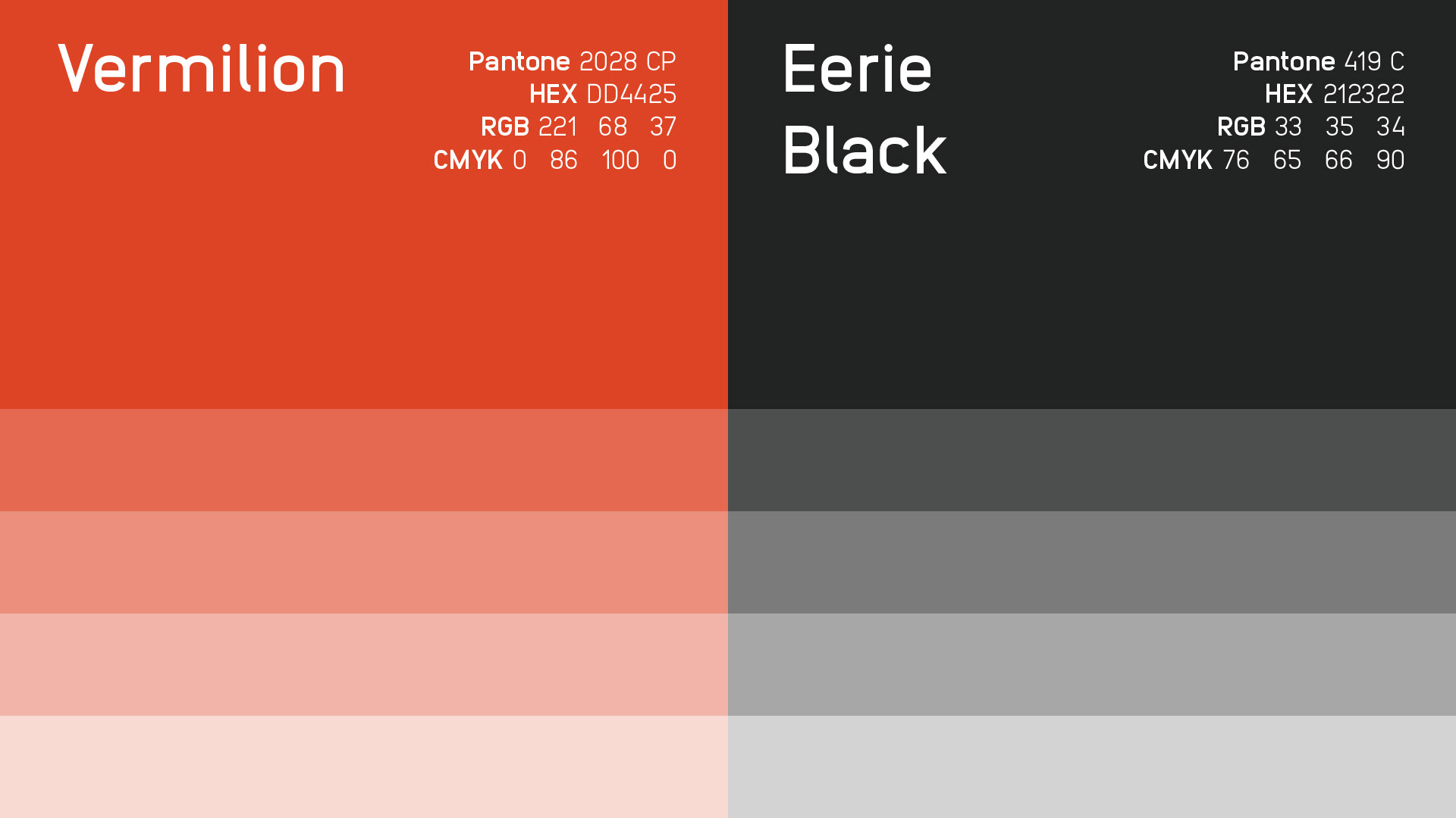
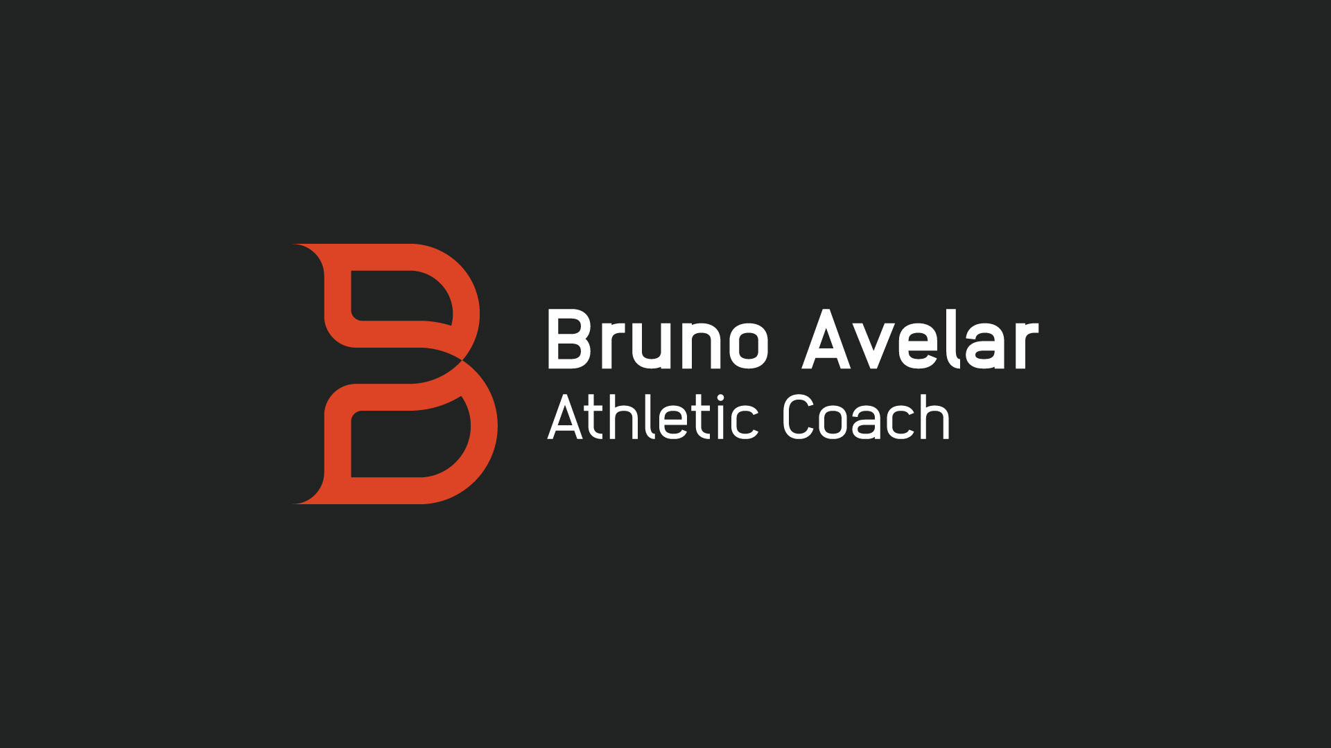
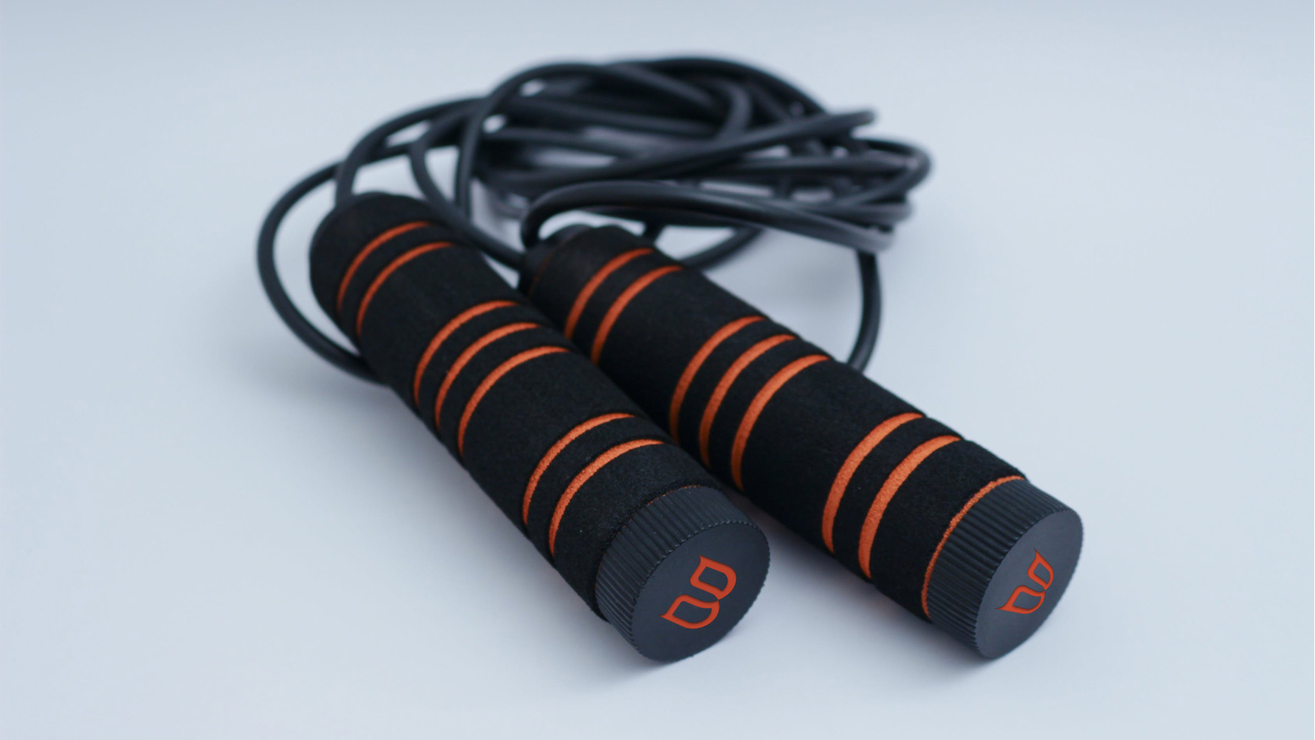
The color palette chosen using orange and black seeks to bring some attributes of the brand, such as energy, leadership, differentiation and boldness. In addition, it helps the brand to position itself in a unique way within its niche market.
PT - BR
_
Bruno Avelar é um educador físico voltado para prática de atividades que englobam a ginástica artística, levantamento de peso olímpico e exercícios com peso corporal. Ele contatou a Ciano para que fosse criada uma identidade visual de estética única e completamente diferente dos seus concorrentes.
Para atingir esse objetivo foi feita uma imersão no mercado de Juiz de Fora e região, bem como na história do próprio cliente, buscando entender quais diferenciais deveriam estar presentes na identidade visual, e também compreender qual seriam os conceitos essenciais da marca.
O símbolo se baseia em dois ícones relacionados à história do cliente. A letra B, inicial do nome da marca, dá forma ao logo, bem como as águias, presentes de forma mais discreta. As águias foram escolhidas por serem o animal símbolo dos Estados Unidos, país em que Bruno fez parte de sua formação e foi fundamental para a sua profissionalização.
A paleta de cores escolhida utilizando laranja e preto busca trazer alguns atributos da marca, como energia, liderança, diferenciação e ousadia. Além disso, ela ajuda a marca a se posicionar de forma única dentro do seu nicho de mercado.