
Bertoni Inmuebles
EN
_
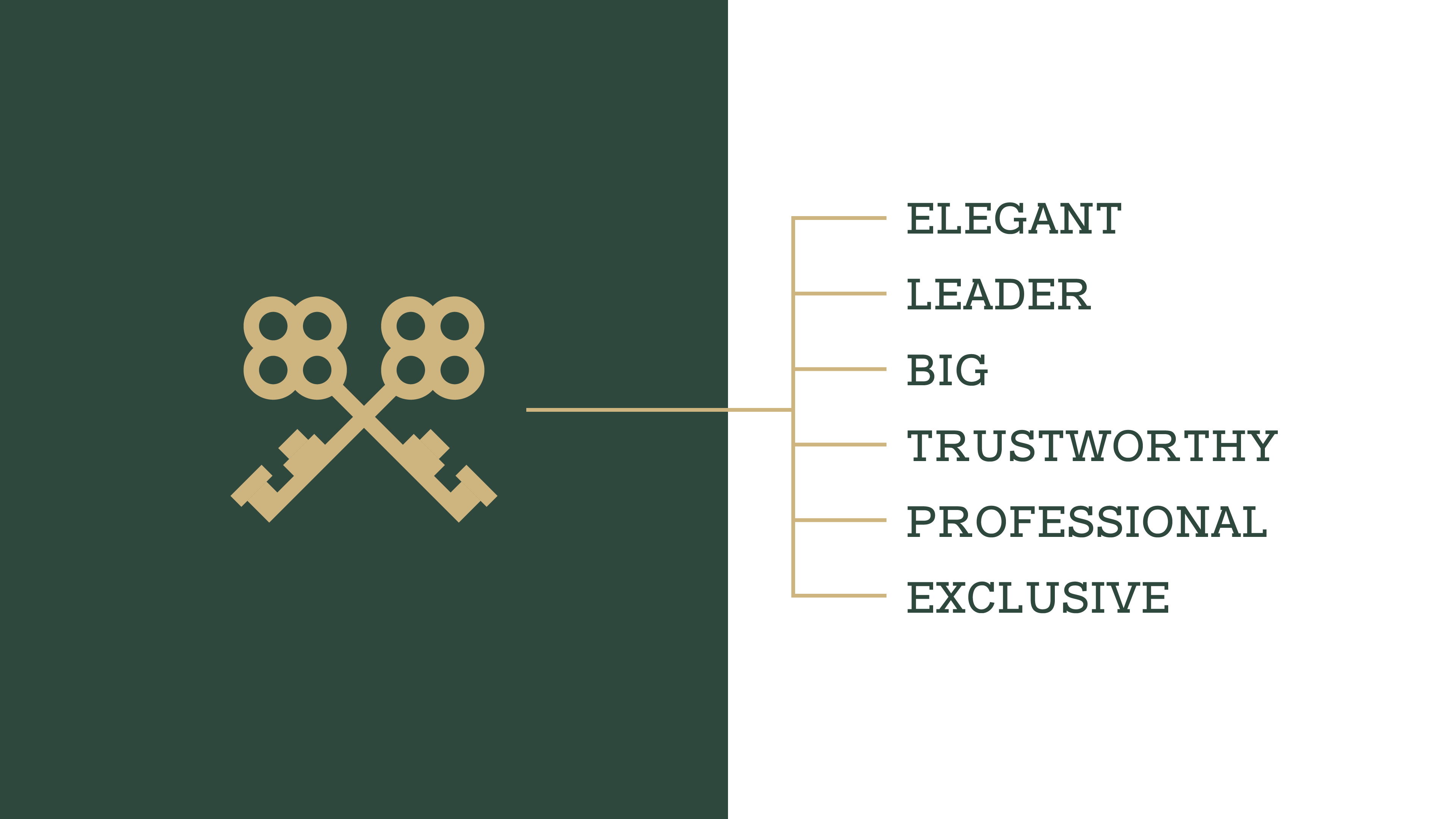
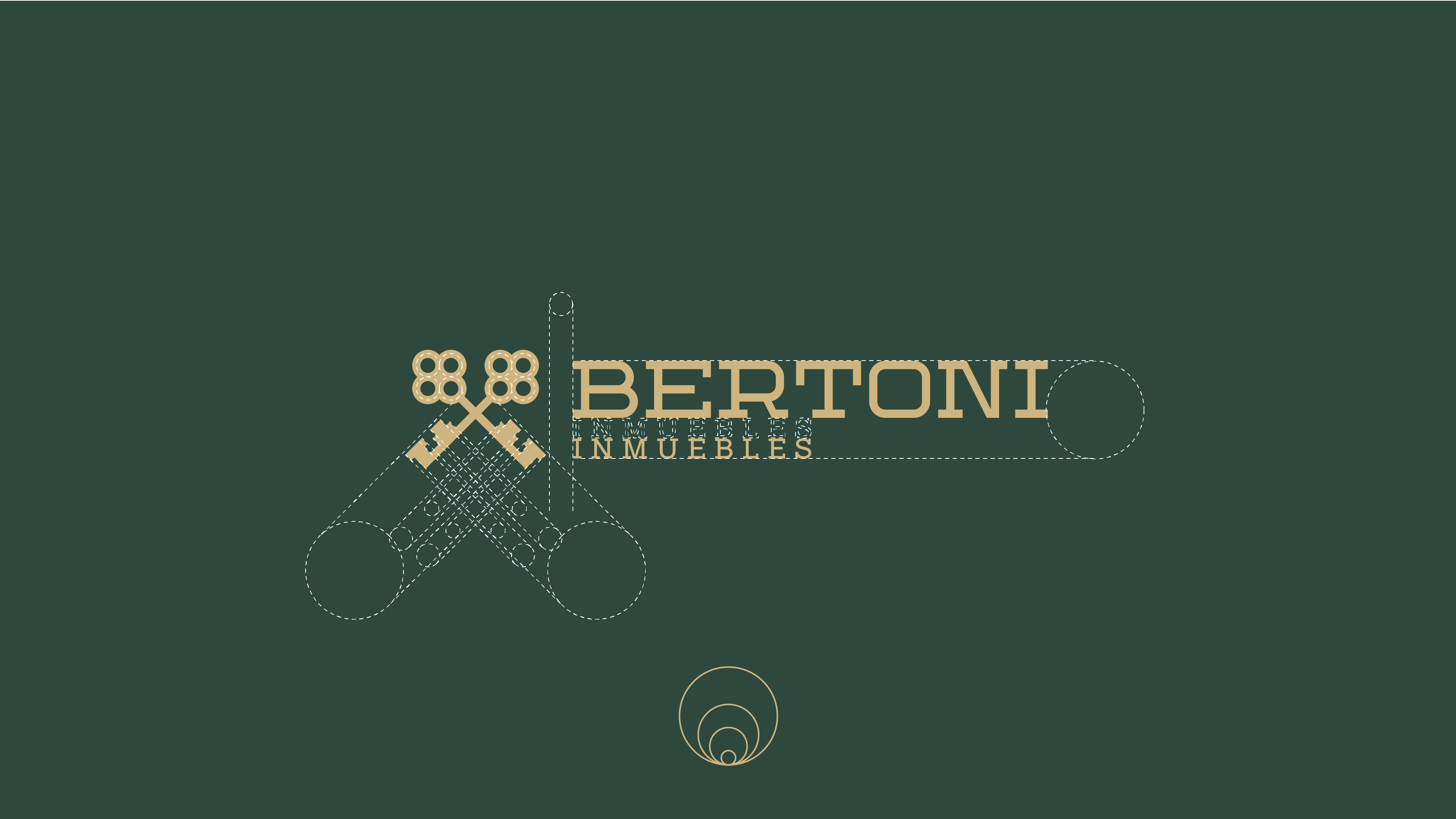
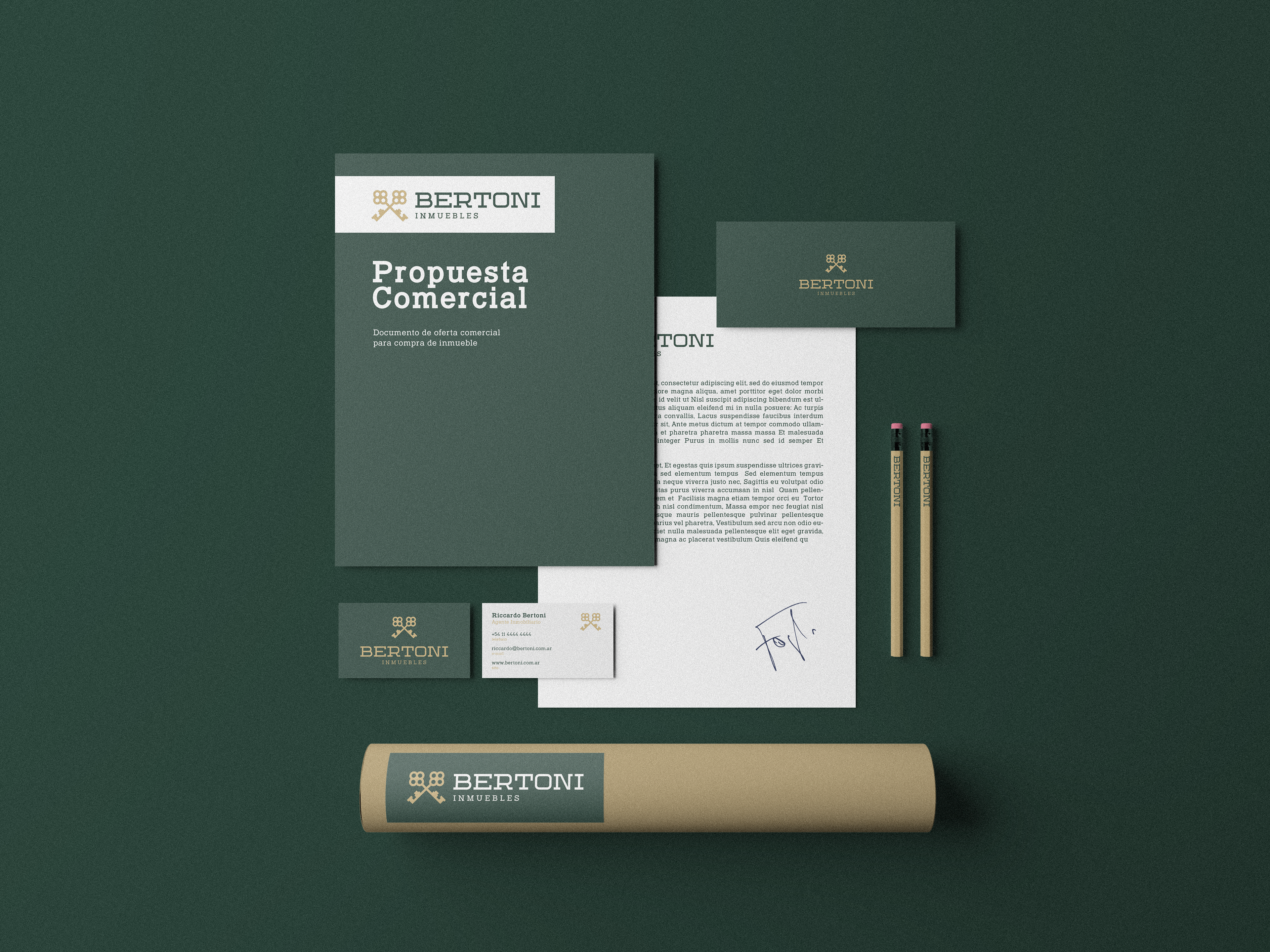
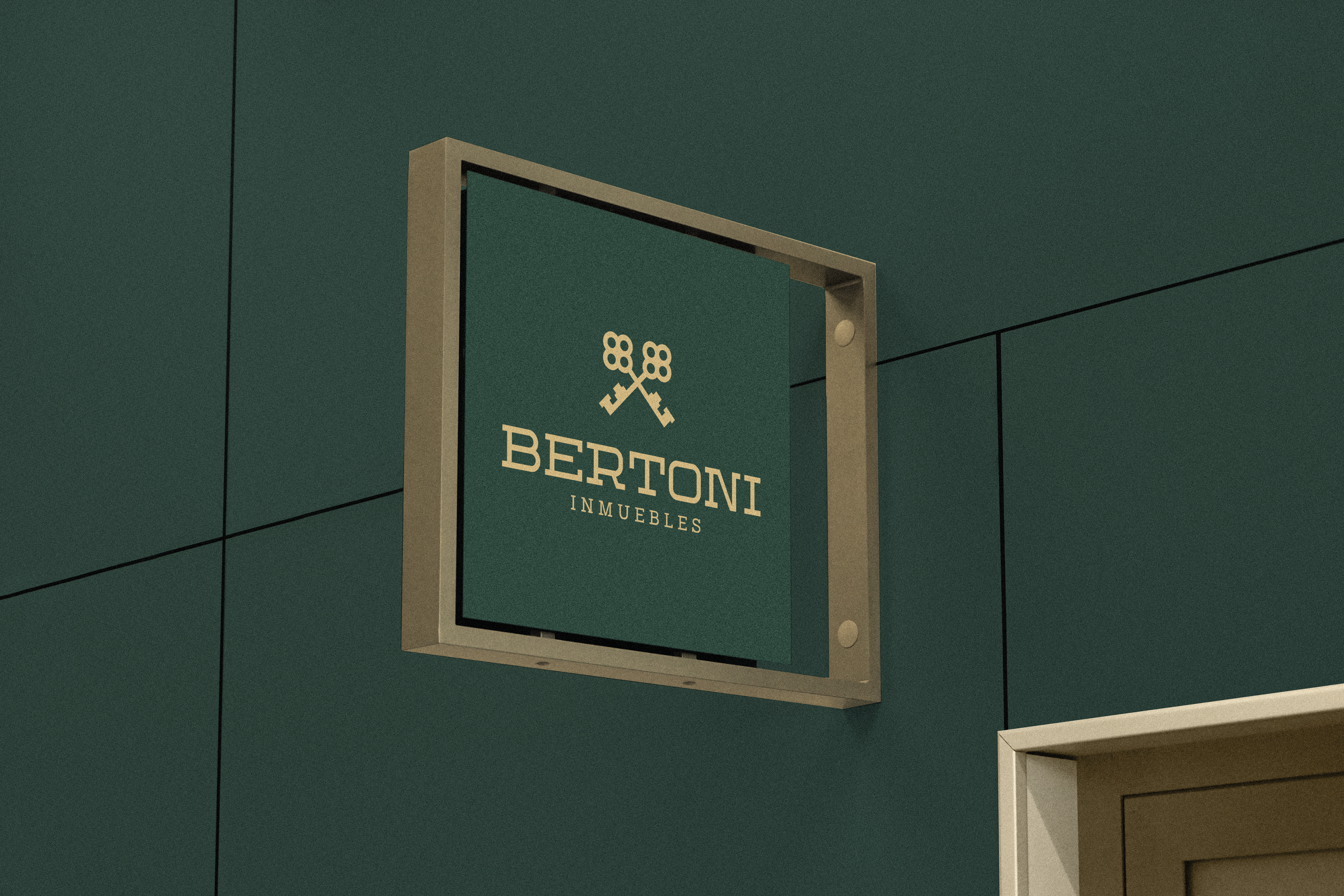
Riccardo Bertoni is the founder of an Argentine real estate company focused on selling high-end homes, and in order for his target audience to be reached in full, he sought us out with a view to creating a visual identity that was able to convey luxury and sophistication, combined with the symbolism of real estate: the keys.
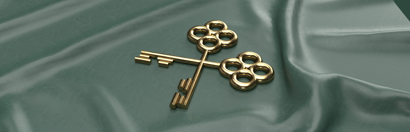
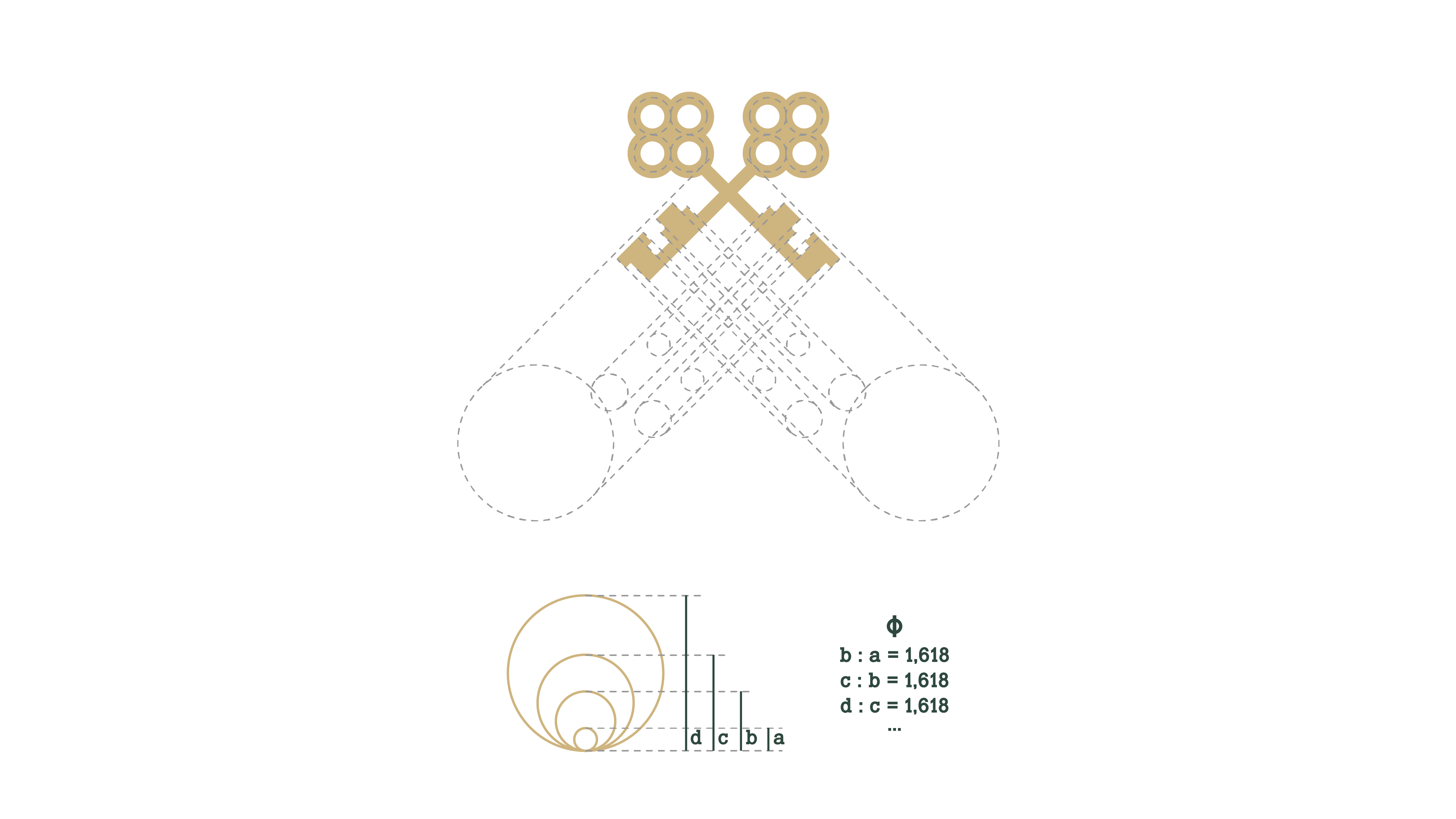
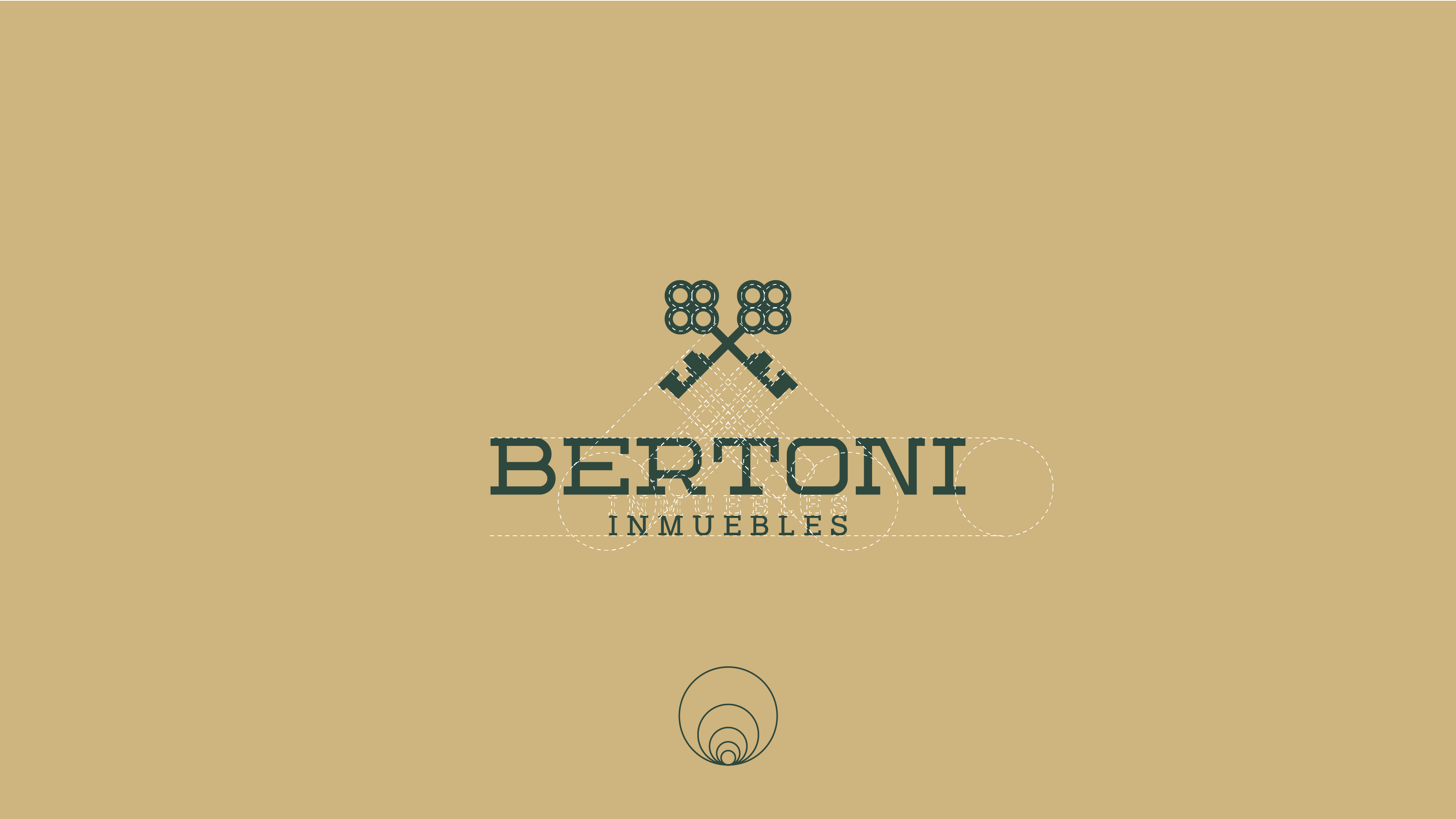
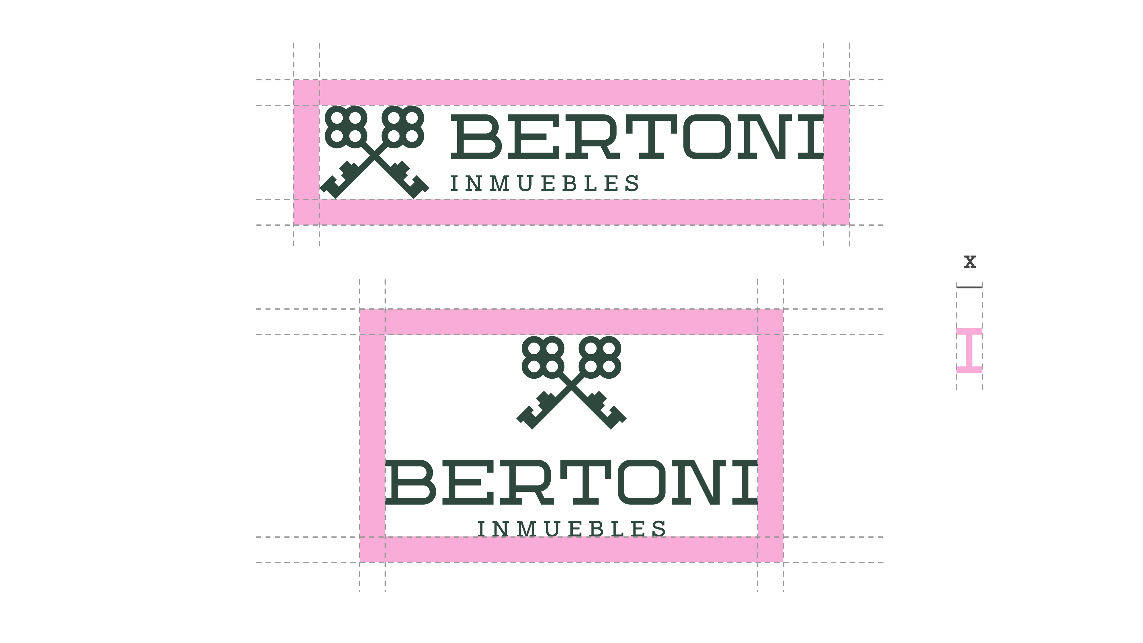
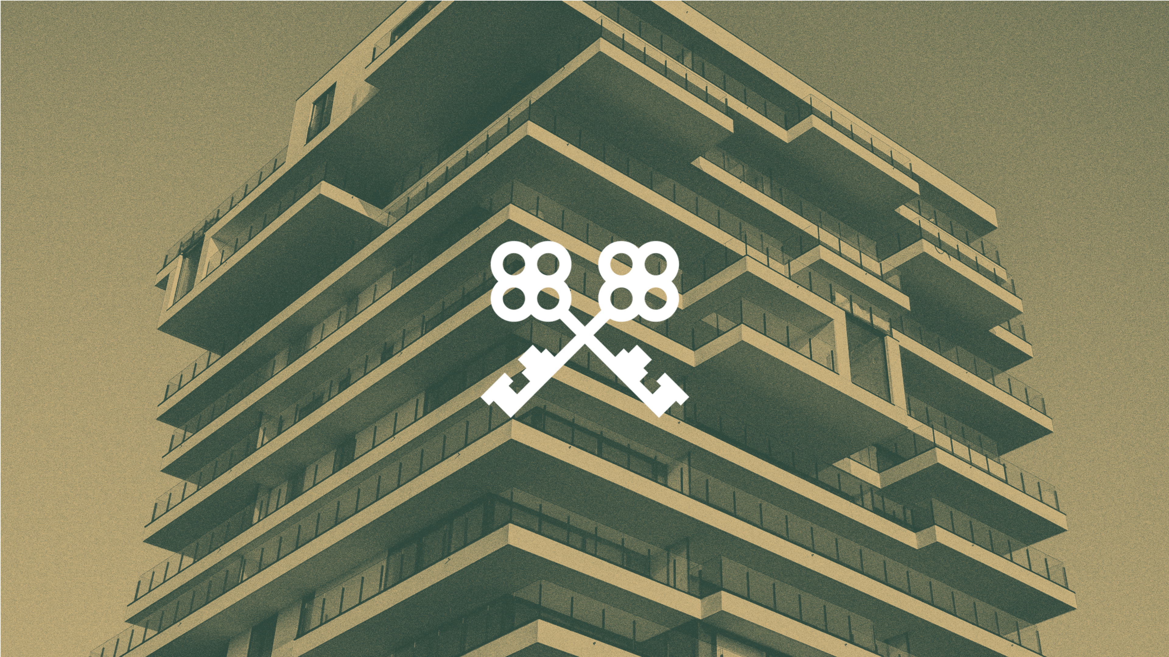
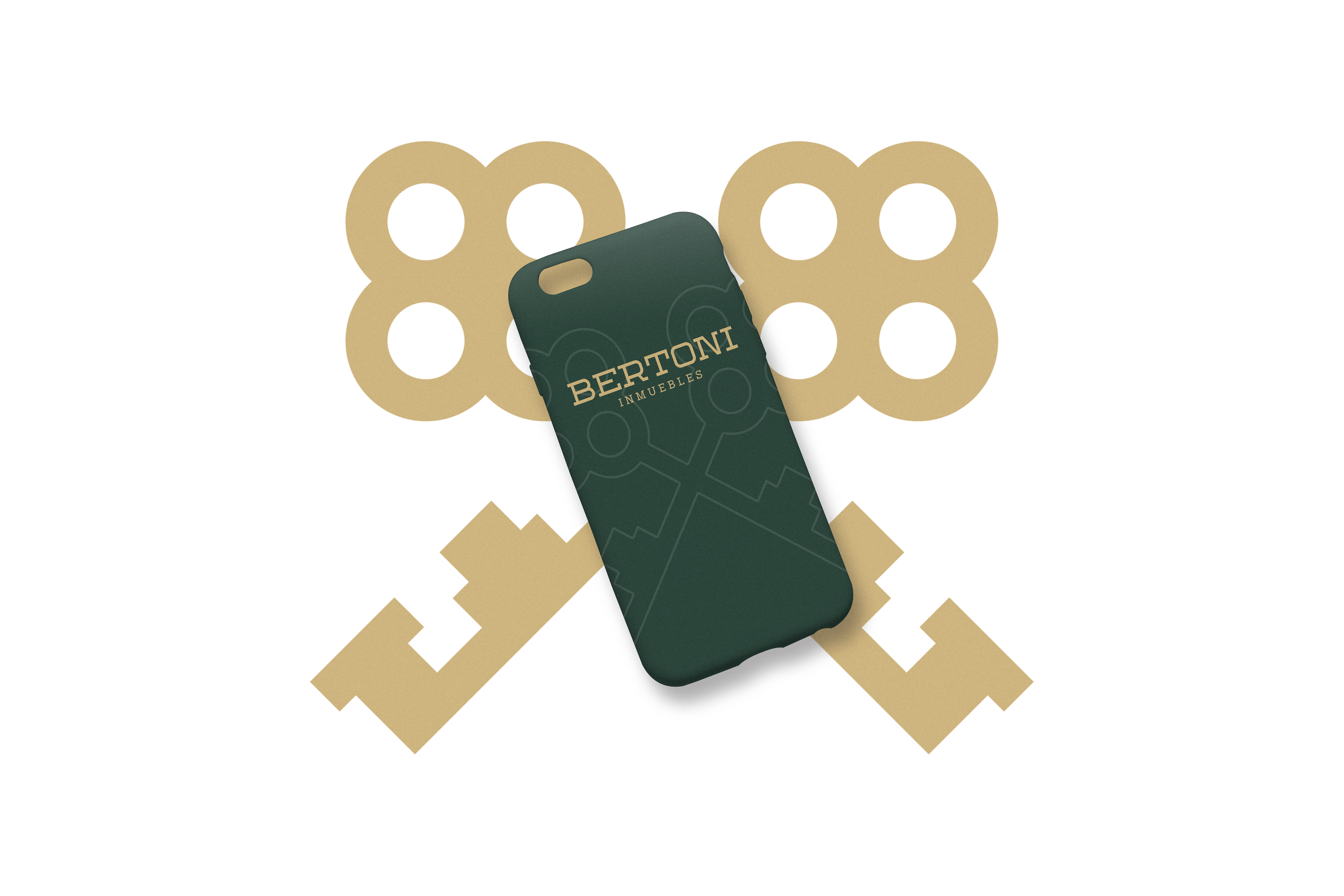
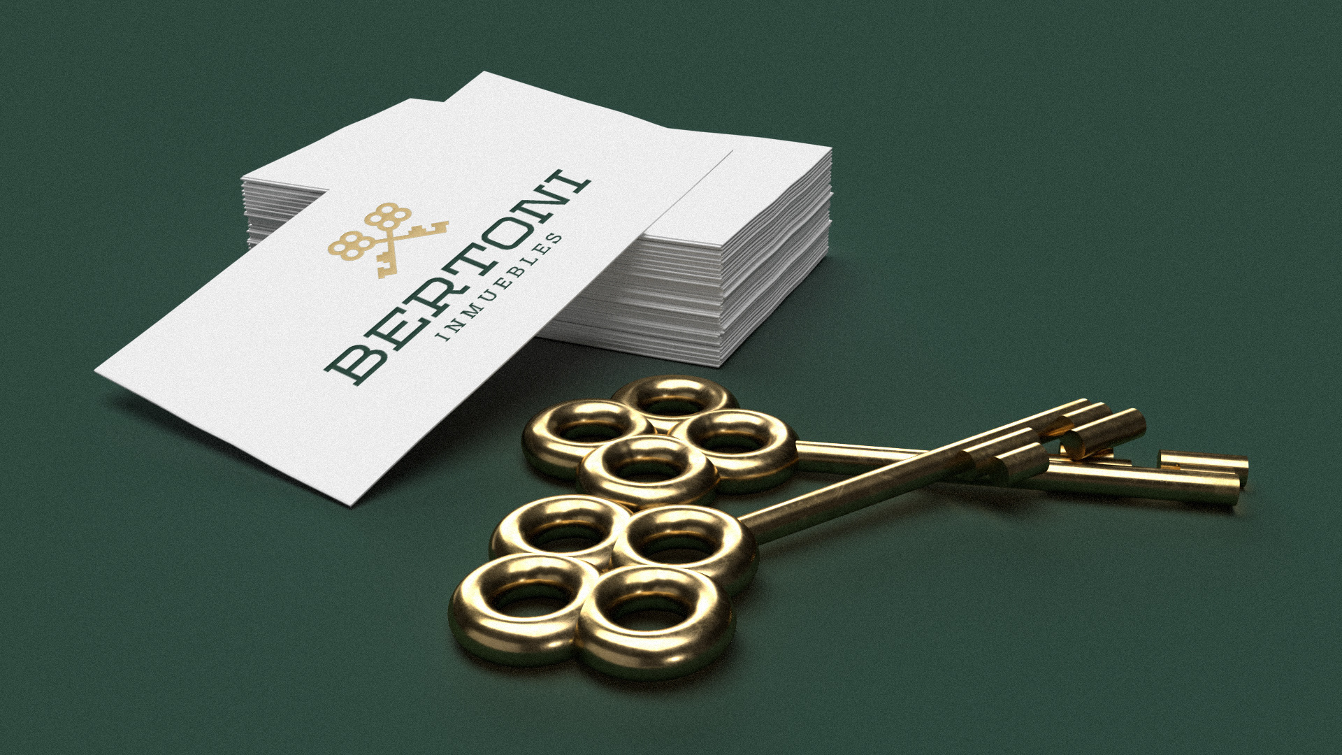
The symbol was all produced from studies in a golden grid, enabling an icon visually comfortable in the eyes of the brand's consumers. The crossed keys are symbolized by protection and trust.
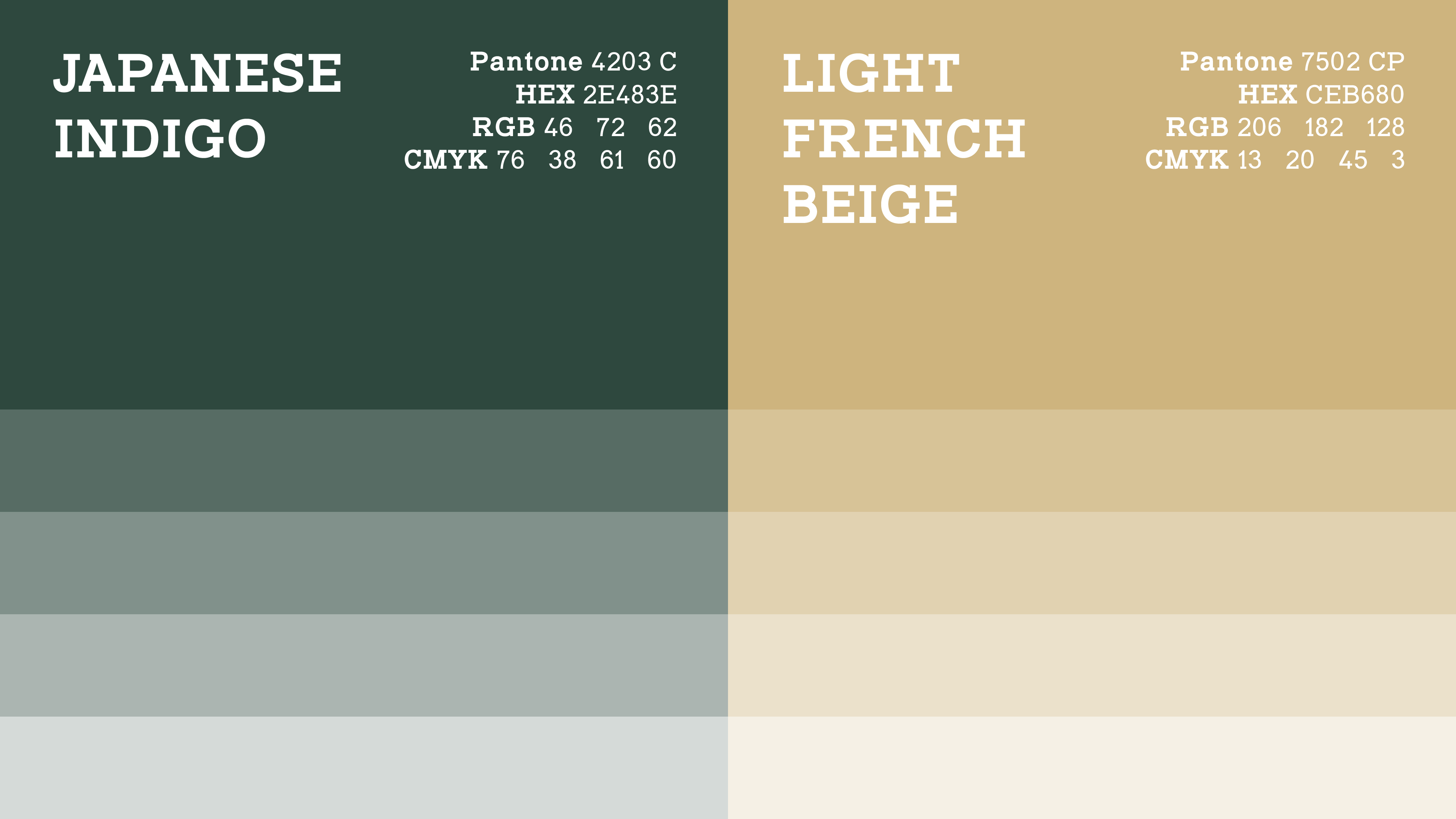
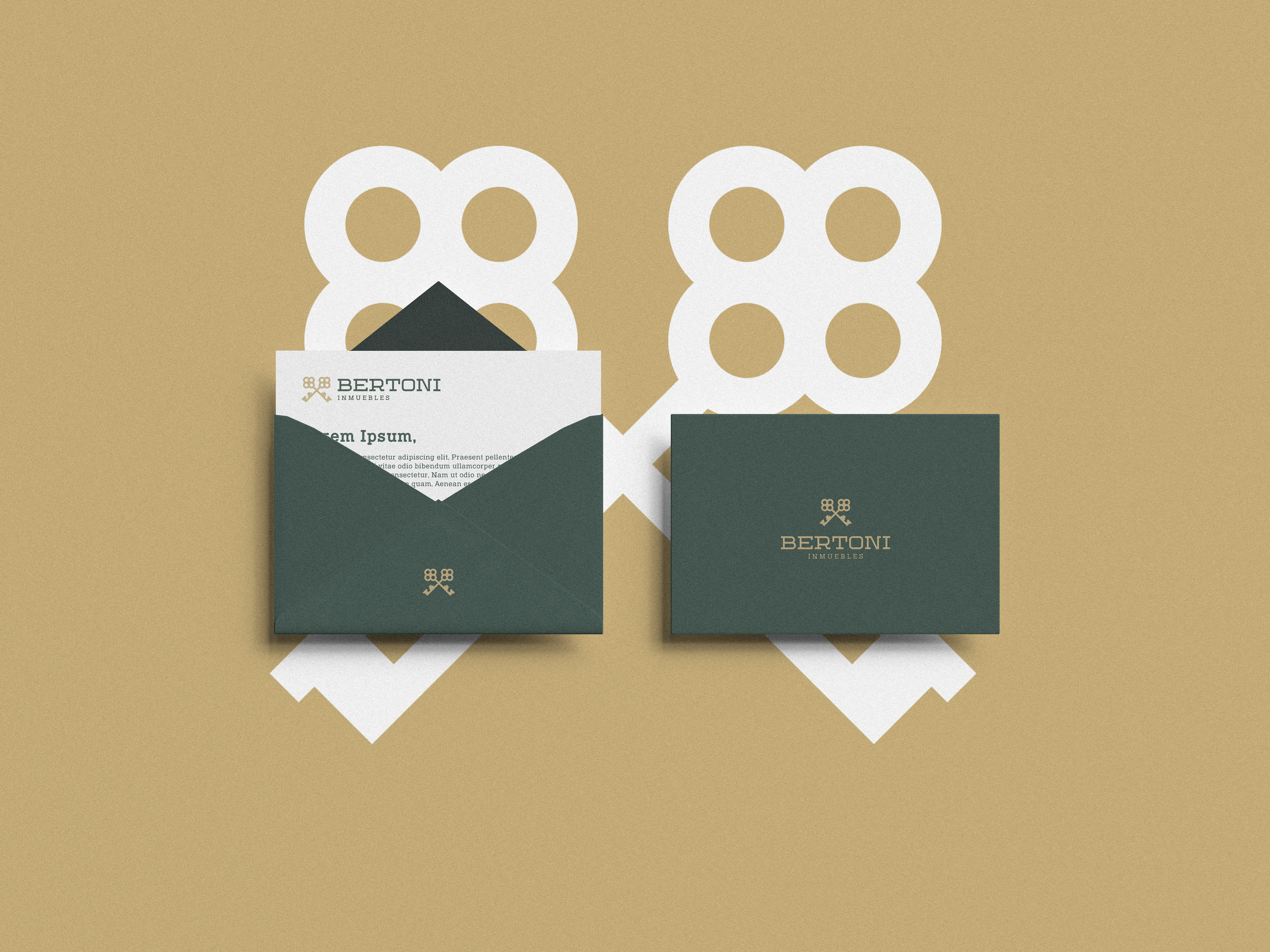
The colors chosen refer to this refinement, seeking to maintain the sobriety of the project. According to the scholar of colors, Eva Heller, green is the most cited color of all to symbolize youth, and moreover it is a color that women and men will like more as their ages advance. In harmony with green, we have gold, treated by most people as the color of wealth and beauty, in addition to bringing elegance and leadership to the visual identity.
PT
_
Riccardo Bertoni é o fundador de uma imobiliária argentina focada em comercializar habitações de alto padrão, e para que seu público alvo fosse atingido em cheio, nos procurou visando a criação de uma identidade visual que fosse capaz de passar luxo e sofisticação, aliada ao simbolismo do ramo imobiliário: as chaves.
O símbolo foi todo produzido a partir de estudos em um grid áureo, possibilitando um ícone visualmente confortável aos olhos dos consumidores da marca. As chaves cruzadas têm como simbolismo a proteção e confiança.
As cores escolhidas remetem à esse requinte, buscando manter a sobriedade do projeto. Segundo a estudiosa das cores, Eva Heller, o verde é a cor mais citada dentre todas para simbolizar a juventude, e além disso é uma cor que mulheres e homens vão gostando mais a medida que suas idades vão avançando. Em harmonia com o verde, temos o dourado, tratado pela maioria das pessoas como a cor da riqueza e da beleza, além de trazer elegância e liderança à identidade visual.